COMPANY
Fandom Tabletop
TYPE
Print
BRIEF
Our first licensed property using the Cortex system was the award-winning Netflix show, The Dragon Prince, produced by Wonderstorm. We worked very closely with the creators to not only make the official roleplaying game, but also to give fans a book that is very much an artbook and a lore compendium. The book was released in tandem with the digital compendium and tools that allow creation of characters.
Logo, layout, and art direction by me.
Foil treatment front and back. Art by Dorothy Yang
Composition by Hanna Hofer, Art by Amagoia Agirre
Art by Shaun Ellis
Composition by Hanna Hofer, Art by Noé Leyva
Left: Noé Leyva, Right: Jessica Fong
Art by Amagoia Agirre
Art by Shaun Ellis
Art by Noé Leyva
Art by Shaun Ellis
Art by Rita Fei
Art by Shaun Ellis
A selection of pre-generated characters that players can run out of the box. Art by Hanna Hofer
Major NPCs that players can interact with. Art by Dorothy Yang
Art by Hanna Hofer and Dorothy Yang
Art by Hanna Hofer
Minor NPCs that can be played by the Narrator. Art by Dorothy Yang
COMPANY
Fandom Tabletop
TYPE
Print
BRIEF
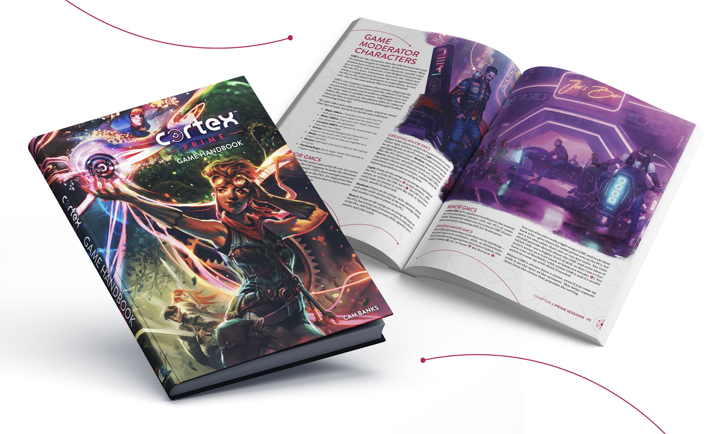
With Fandom’s acquisition of the Cortex roleplaying system created by Cam Banks, a new omnibus was required to collect all the rulesets that have been used in previously-licensed product and introduce more building blocks for consumers to make their own roleplaying game. The look was developed to look like a faded chemistry textbook from the 60s/70s. All layout and art direction done by me.
More than 50 artists from diverse backgrounds all over the world were assembled to create artwork that was meant to inspire creators to show the different worlds one could create a game in that wasn’t just fantasy or science fiction.
The final product was nominated for the following 2021 ENNIE awards:
Best Art, Cover
Best Art, Interior
Best Game
Best Layout and Design
Best Rules (Silver)
Product of the Year
Cover features spot gloss. Art on spread by Lie Setiawan
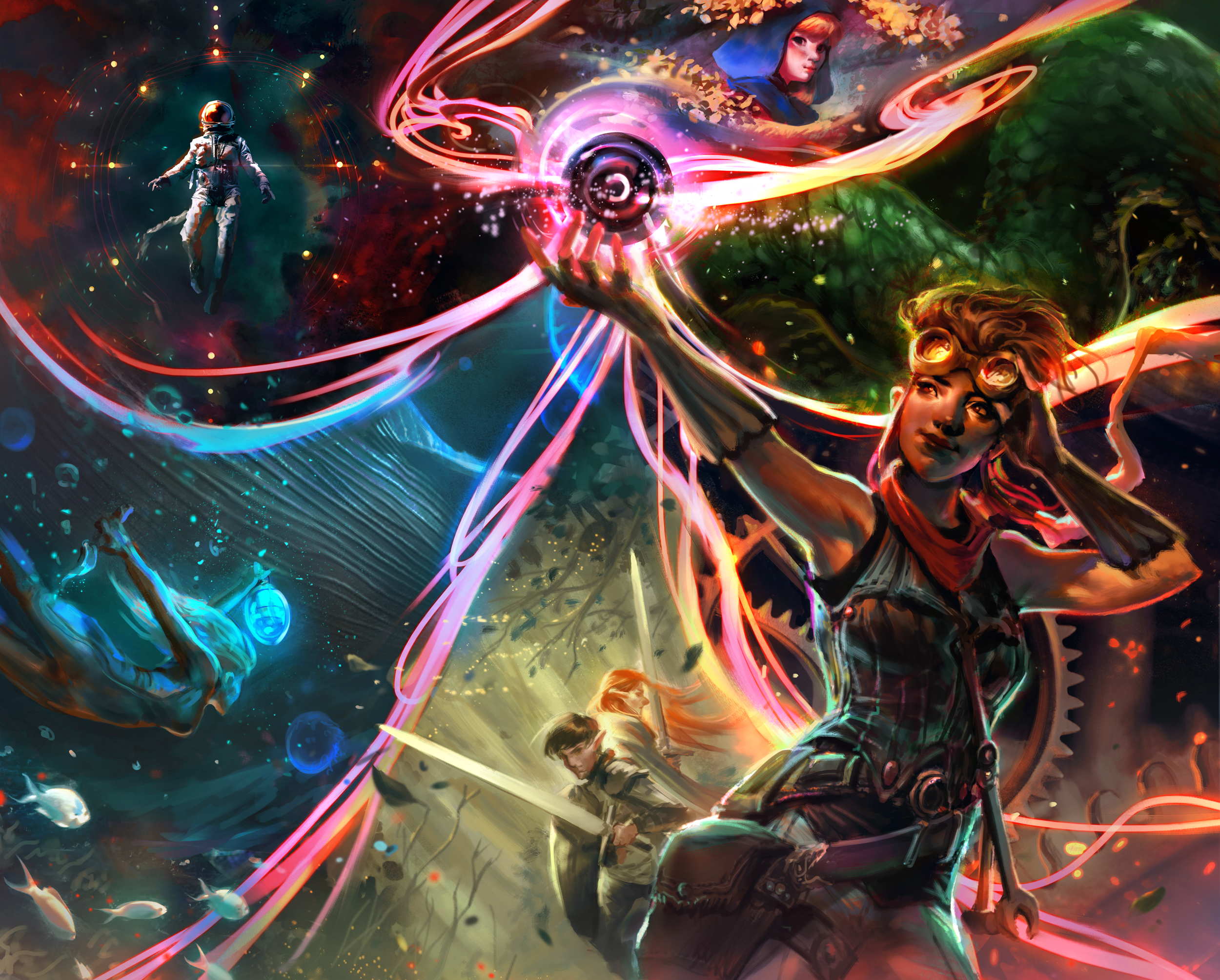
Six characters were conceptualized to represent character archetypes in most stories. These characters appear in different forms throughout the book as a running theme to demonstrate the flexibility of both the Cortex system and these characters in different universes and forms. Art by Yangtian Li
Nominated for Best Art, Cover in the 2021 ENNIE awards. Each archetype is represented in the cover. The composition is an update of a cover drawn by Brett Barkley for a previous Cortex book. Art by Merilliza Chan
Each opening chapter art features an archetype, this one features the Beast, which is an antagonistic force. Art by Anna Neumannová
Left: Reza Afshar, Right: Thomas Scholes
Left: Oriana Menendez, Right: H. Won
Art by Grace P. Fong
Art by Vanessa Morales
Art by Bethany Berg
Art by Artur Treffner
Art by Coey Kuhn
Art by Julia Metzger
Art by Lenka Šimečková
Art by Carol Azevedo
COMPANY
Project TriForce
TYPE
Branding, Packaging, Print
BRIEF
Worked closely with game developers to develop premium collector’s editions for video game releases. Development included creating assets from in-game graphics, designing product, developing branding, and keeping to style guides.
COMPANY
WizKids
TYPE
Branding, Packaging, Print
BRIEF
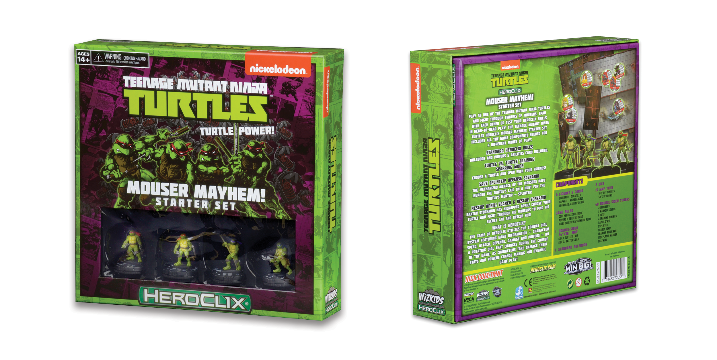
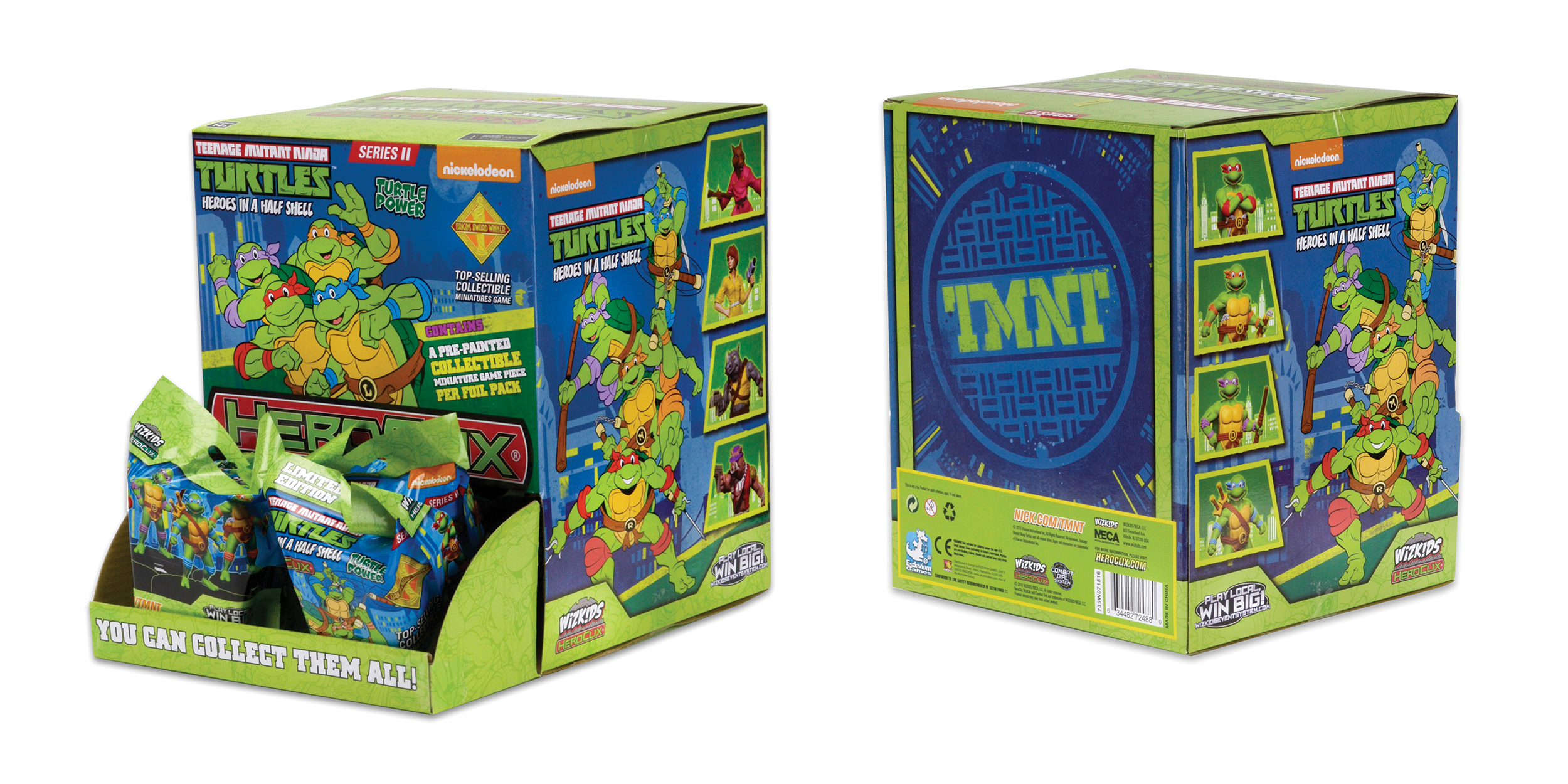
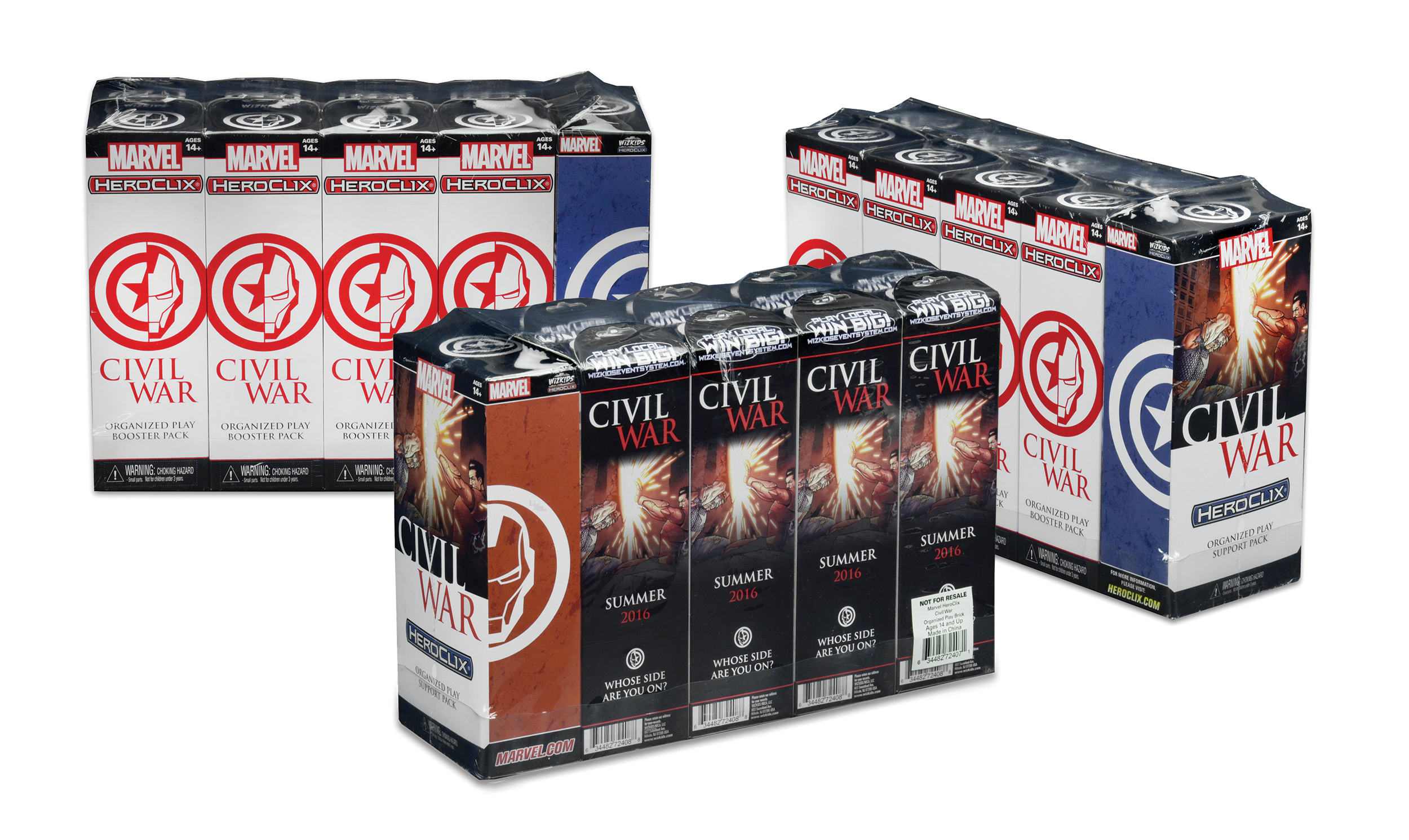
When it comes to children’s products, form has to blend with function and fun. That’s how we designed branded packaging for the different licensed HeroClix collections. We worked with licensors such as Wizards of the Coast, DC Comics, etc. HeroClix is WizKids’s proprietary figurines with built-in stats.
COMPANY
Lineage Studios
TYPE
Branding, Packaging, Print
BRIEF
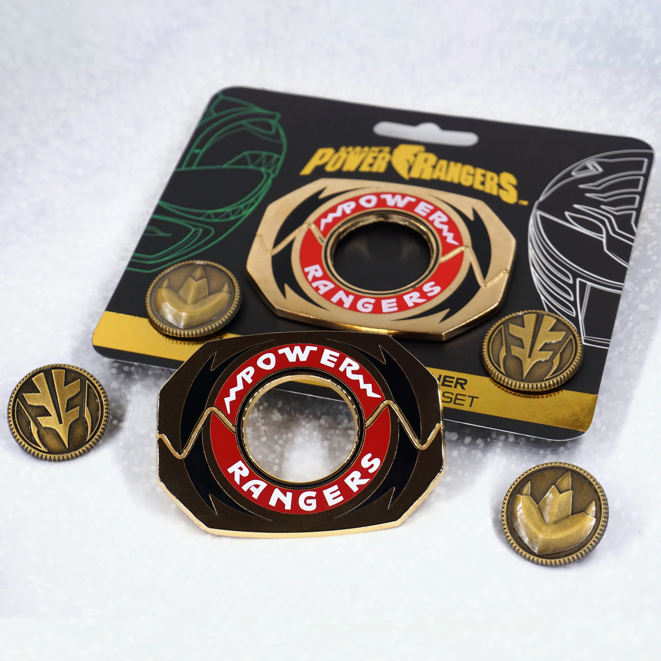
Worked closely with Saban to develop premium pins for Power Rangers. Development included creating new graphical assets from the television shows, designing packaging, developing branding, and keeping to style guides.
Morpher featuring the coins of the character, Tommy Oliver, throughout his many incarnations.
Original team from Mighty Morphin’ Power Rangers.
Shows spot gloss and foil-stamping on packaging.
CLIENT
The AbleGamers Foundation
TYPE
Visual Design
BRIEF
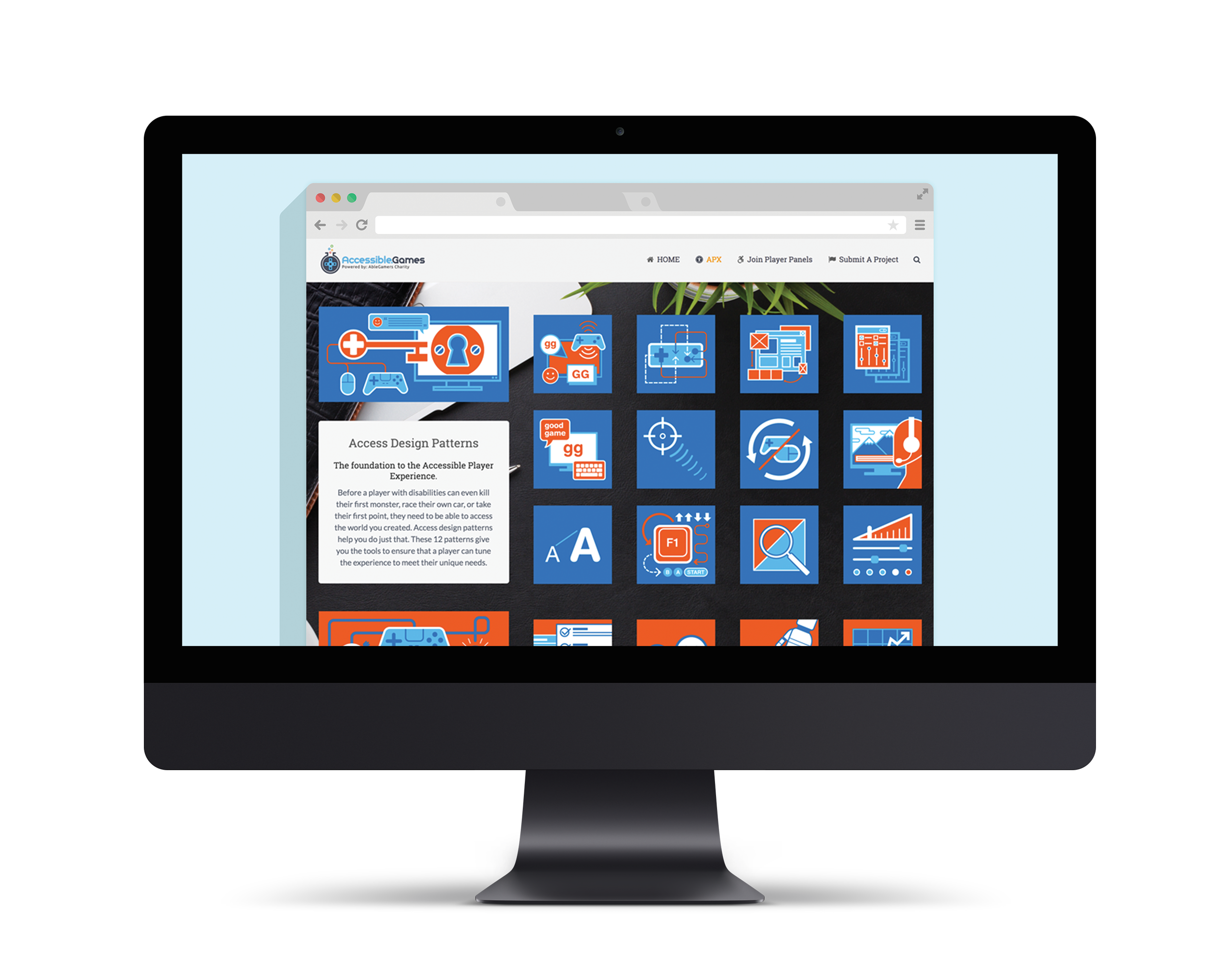
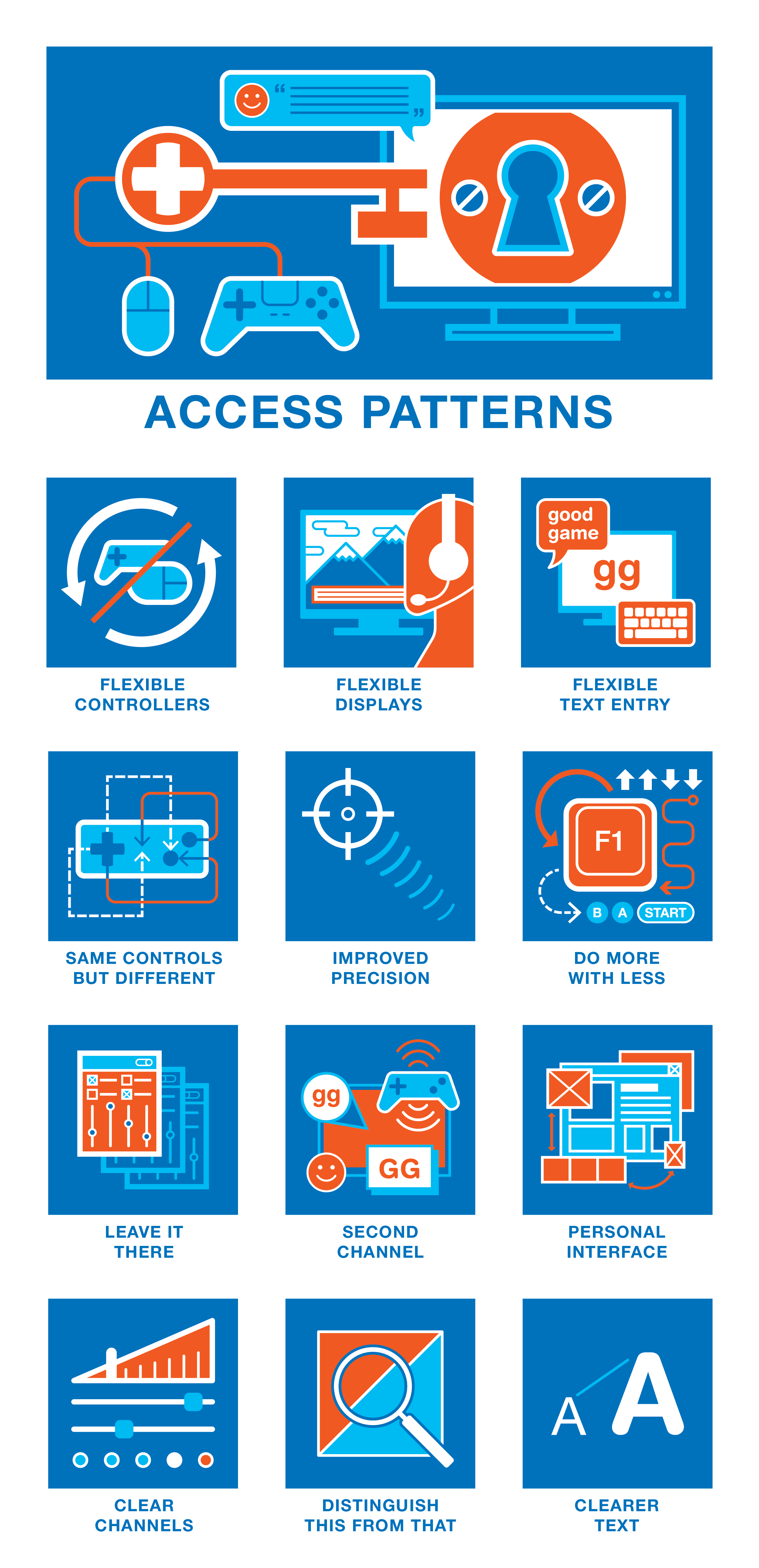
The Accessible Player Experiences is a program created by AbleGamers to help game developers learn about making their games accessible to a wide range of people with disabilities. They turned to me for help creating a program of visual icons and a logo. Because accessibility is important for this series, the entire icon set was developed to be readable by those with colorblindness.
Learn more about The AbleGamers Foundation’s mission to bring accessibility to game development here.
Webpage describing each of the APX concepts and their applications.
Total collection of Access Patterns.
Total collection of Challenge Patterns.
Many iterations before I arrived at the icons used in the final collections.
CLIENT
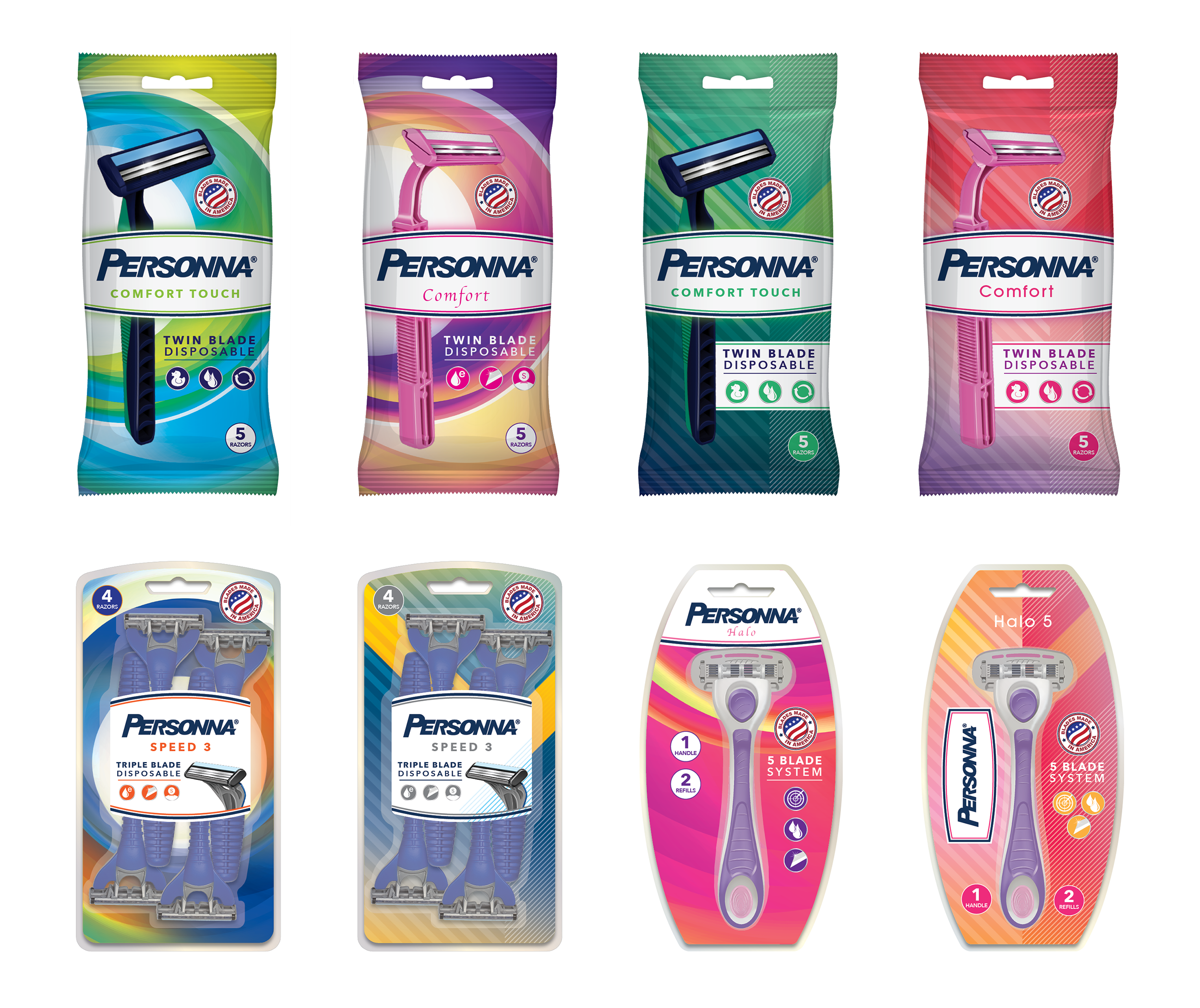
Edgewell Personal Care
TYPE
Branding, Packaging, Print
BRIEF
From start to finish, this project required focus on the detail. I was asked to create an international style guide for Personna brand, that highlighted American quality and value. It included packaging and catalog examples. This guide is currently used in markets in Turkey, Australia, Mexico, and other locations.
Every year, we revisit the style guide to update elements and guidelines as trends and demands change.
COMPANY
General Assembly (as part of User Experience Design course)
TYPE
Digital, UI/UX
BRIEF
For our User Experience Design course at General Assembly, students had to work on a capstone project for the entirety of the course. I chose to focus on a medication reminder application that specialized in avoiding side effects and drug interactions. You can check out my prototype here.
How I arrived at the problem statement at the center of my app through comprehensive user interviews and organizing my observations.
Defining the goal of the application.
User interviews were distilled into a primary and secondary persona.
The Journey of the primary and secondary personas.
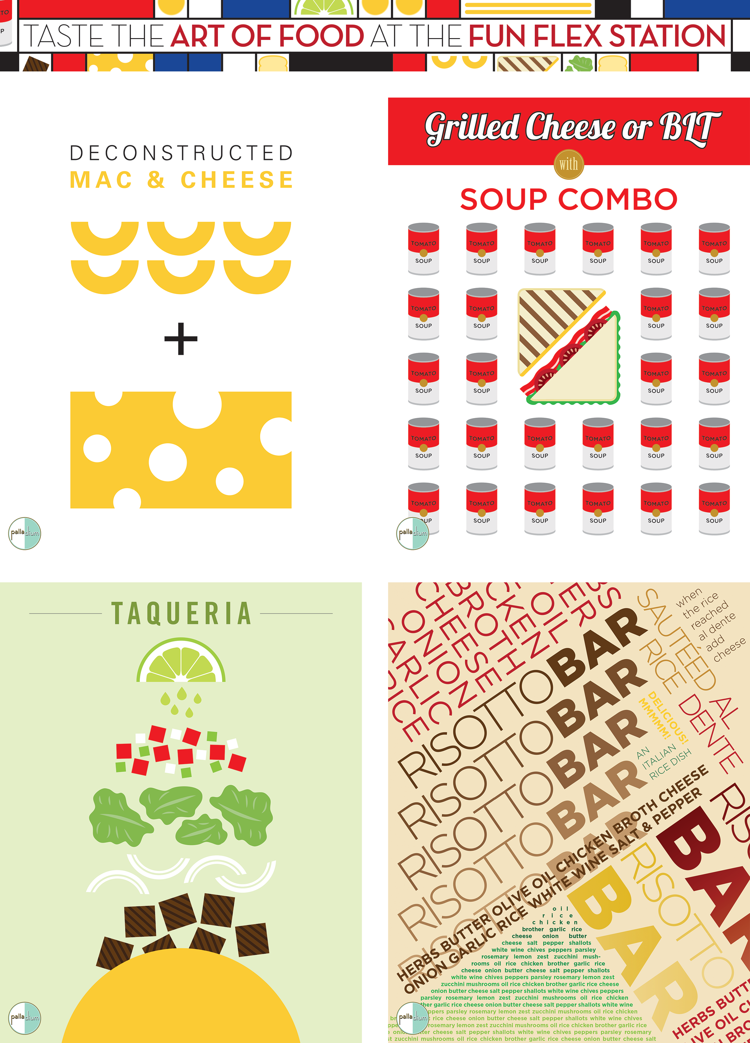
CLIENT
Aramark at New York University
TYPE
Branding, Print, Illustration
BRIEF
Here, I got to use my skills as a designer and as an illustrator as I created a range of dining promotions. This 7-year relationship resulted in polished branding for dining halls, many posters and flyers, booklets, menu boards, and more.
CLIENTS
Various, see descriptions
BRIEF
I’ve created logos that stand out for businesses from pierogi shops to real estate firms.
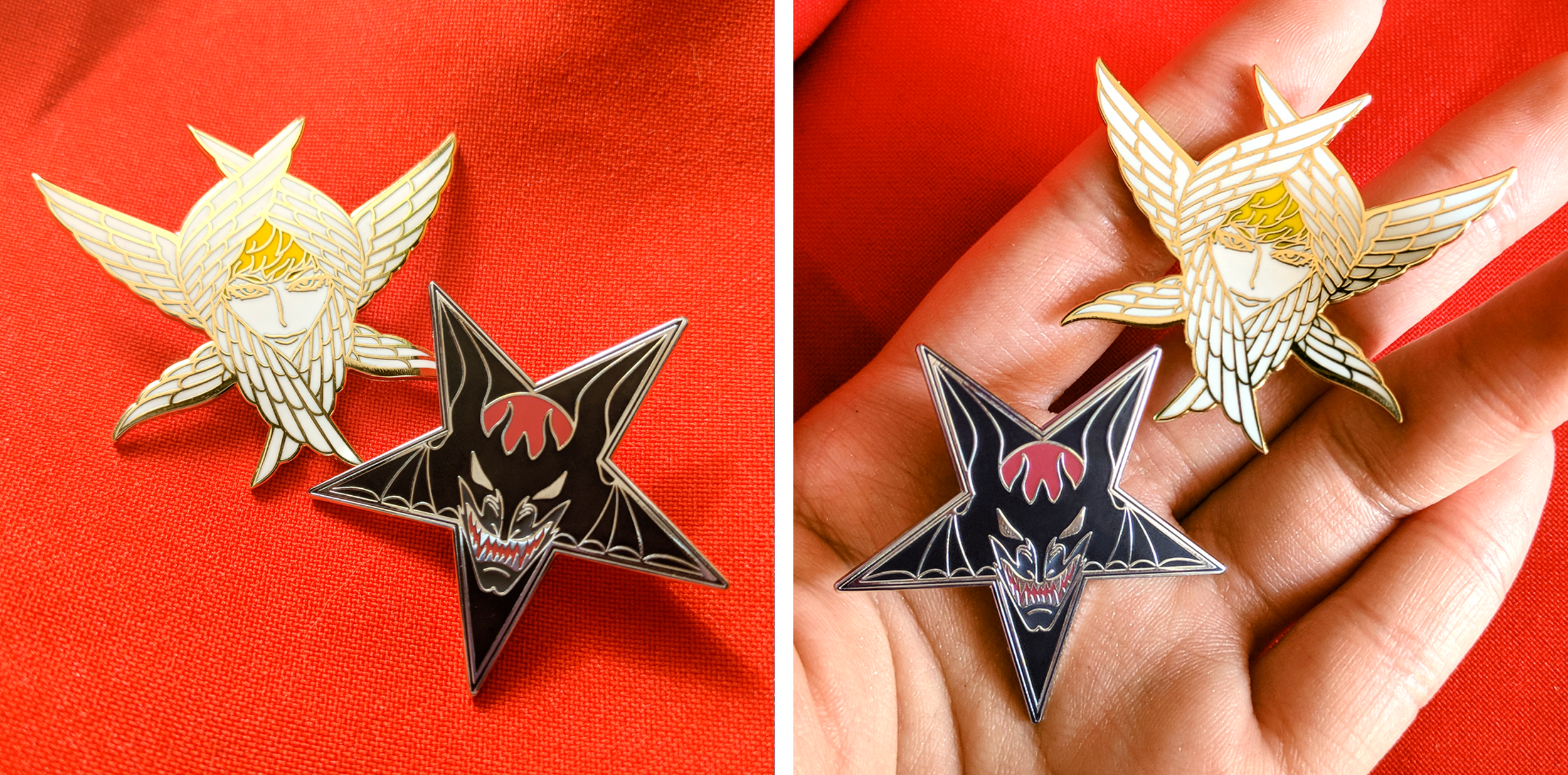
In addition to creating custom illustrations for clients, I also have a lot of fun creating enamel pins and posters in my spare time. You can buy pins and some of my posters at my online store: shop.turnon.red
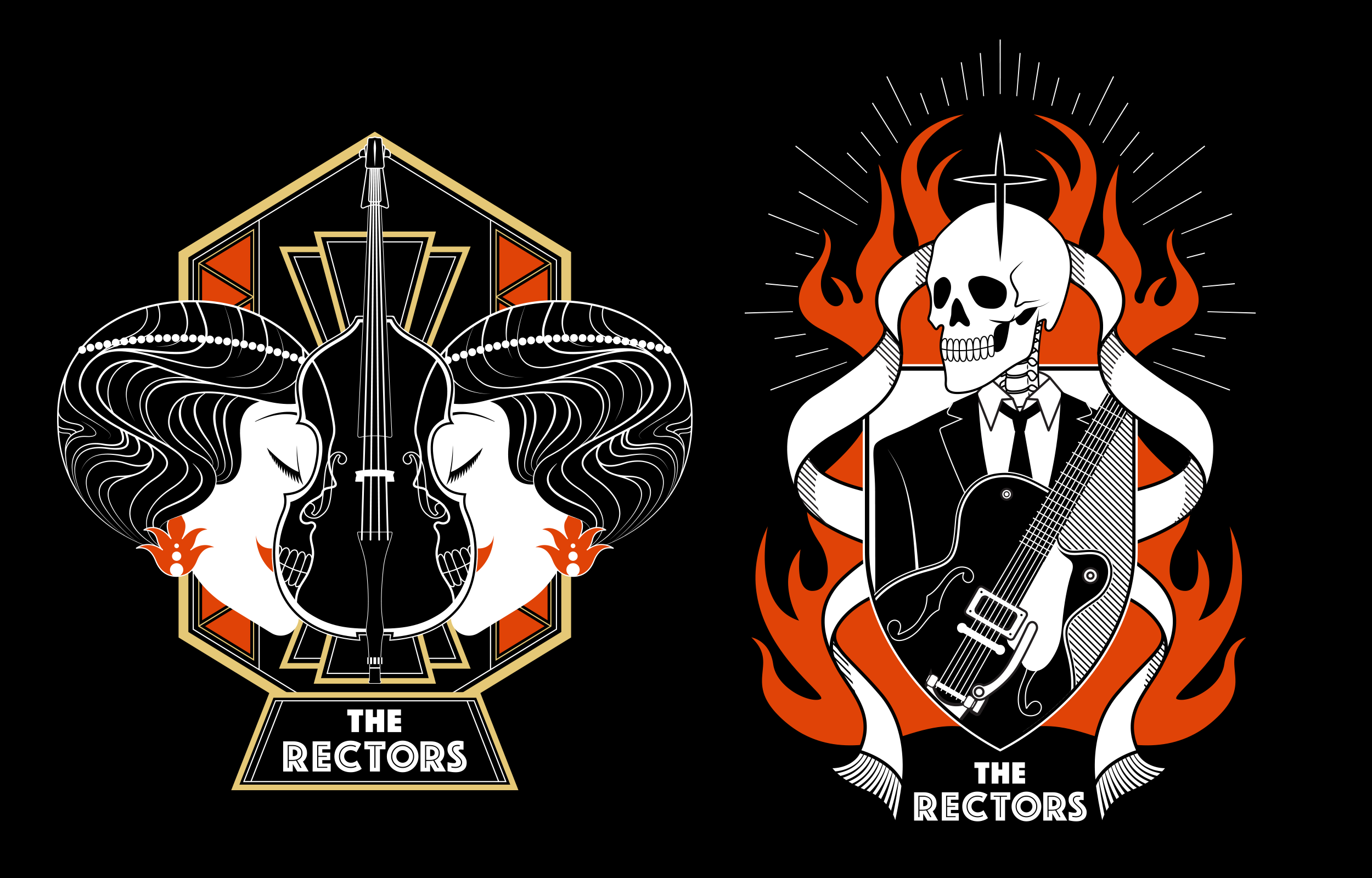
Created for Philadelphia-based rockabilly band, The Rectors, for their EP, “Seven Deadly Songs.” Both are based on a member of their band.
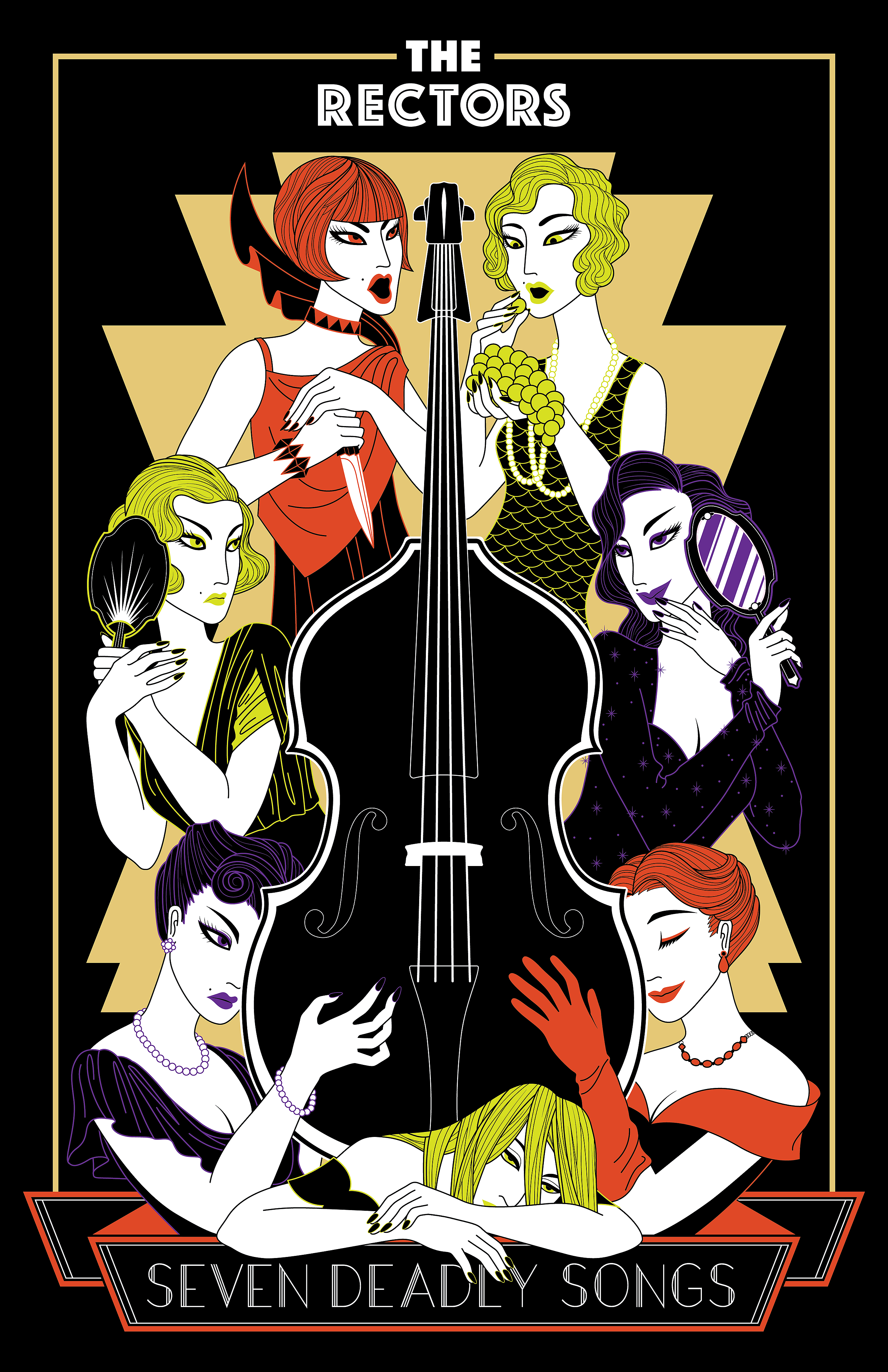
Full poster illustration for The Rector’s EP.
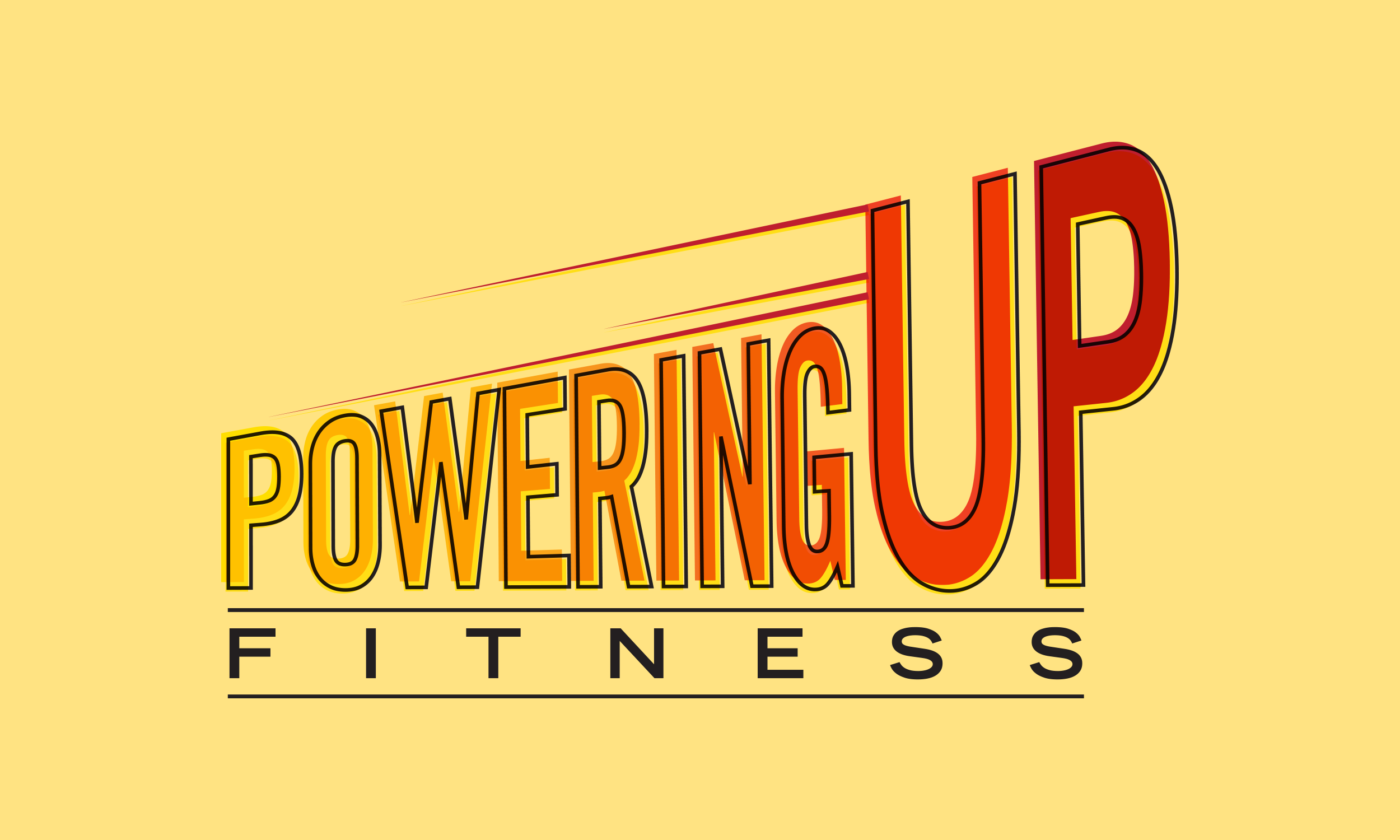
Fully hand-lettered.
Cover featuring Commander Shepard for digital magazine, Unwinnable, for May 2018.
Lyrics from my favorite song off iamamiwhoami’s BLUE album
Successfully Kickstarted in 2018.
2013 Creative Allies Winner.
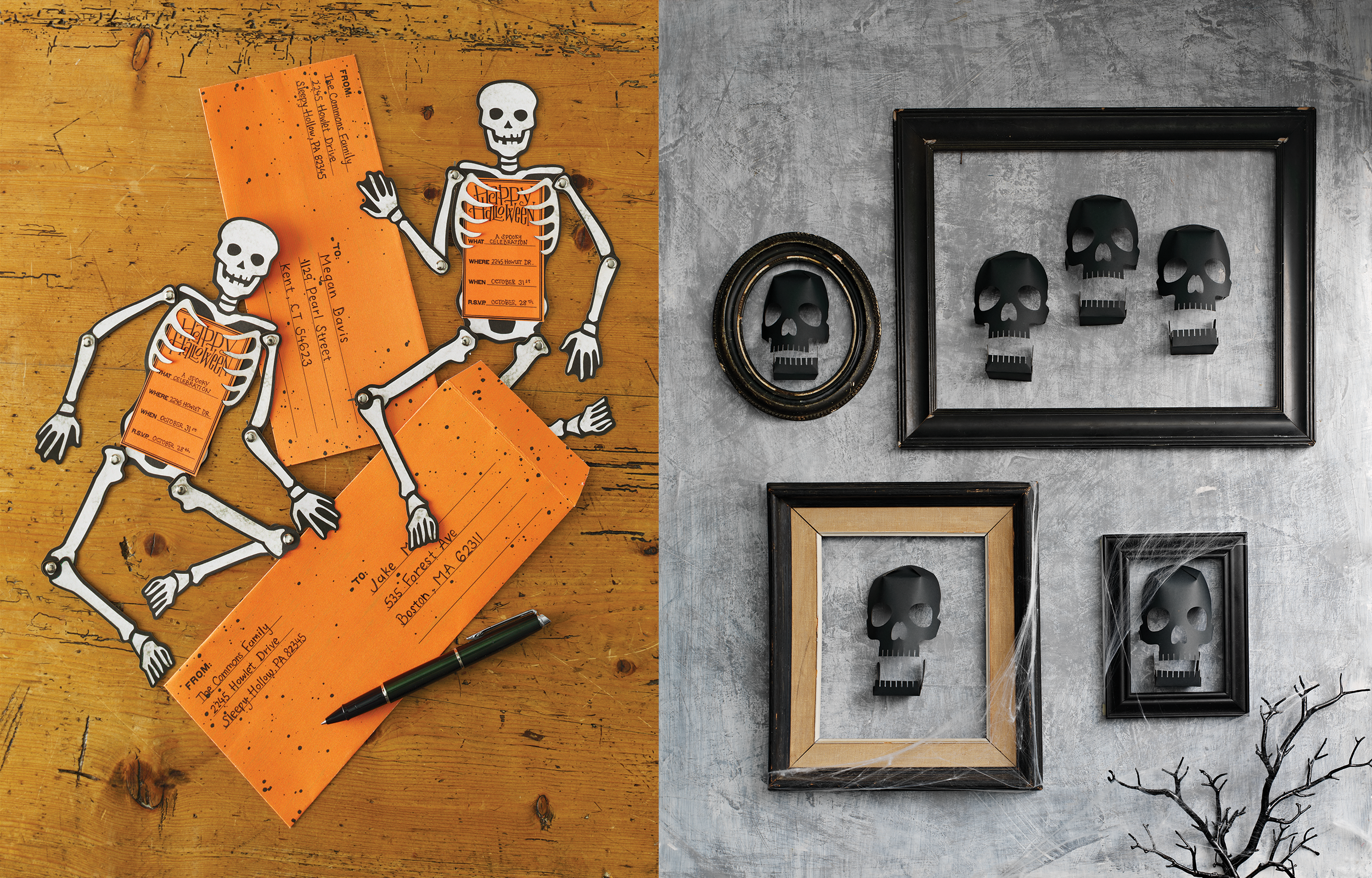
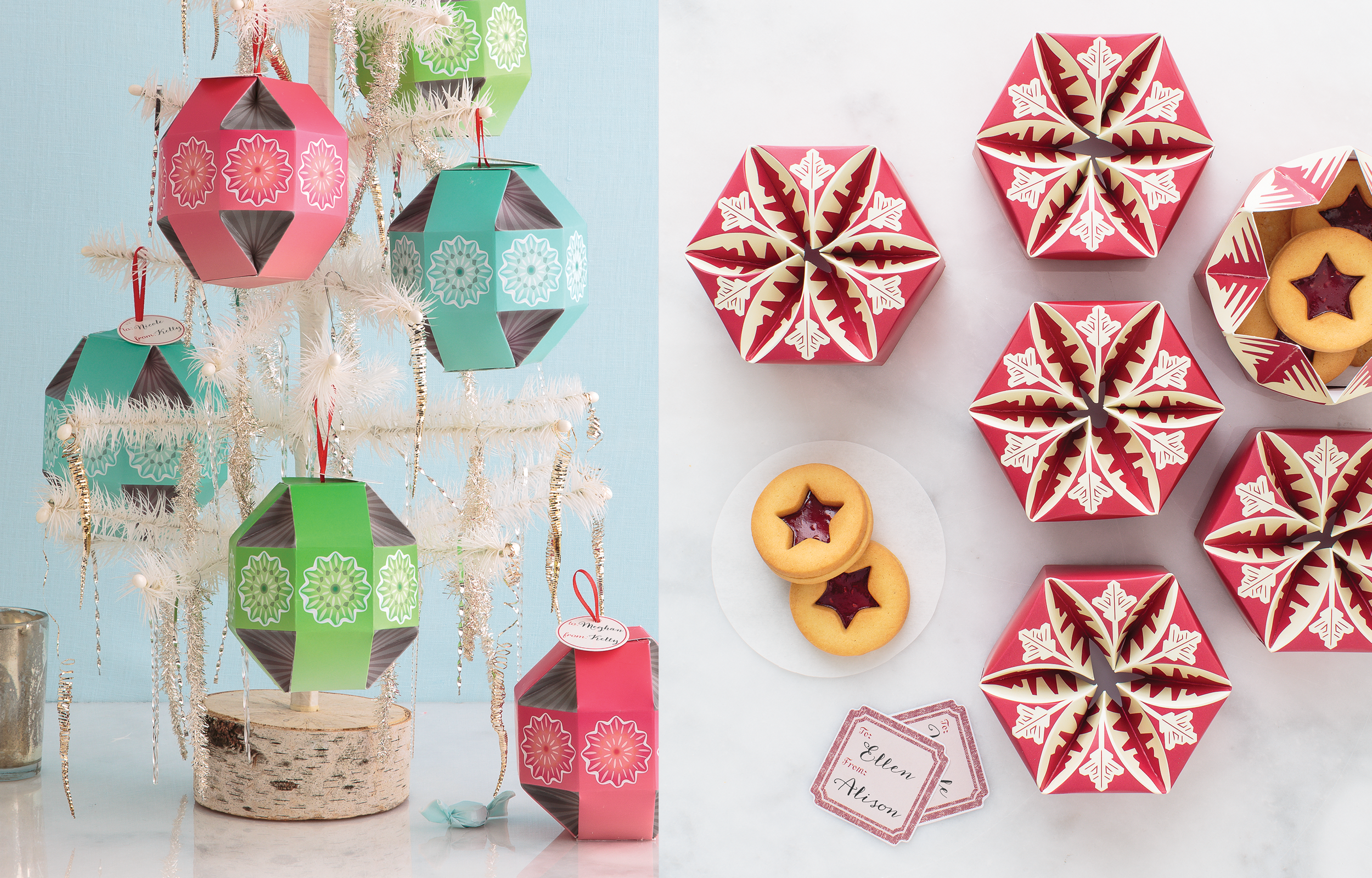
COMPANY
Martha Stewart Crafts
TYPE
Packaging, Layout
BRIEF
Of course an iconic brand like Martha Stewart needed something special. I created unique food packaging and stationery products for iconic holidays including Valentine’s Day, Halloween, and Christmas. Fun fact - all the dielines seen here were developed from scratch.